Poster design
Here are a few posters I’ve created out of personal interest. Poster design is one of my favorite exercises because of its lack of constraints, making it an ideal space to experiment with different design techniques and approaches.
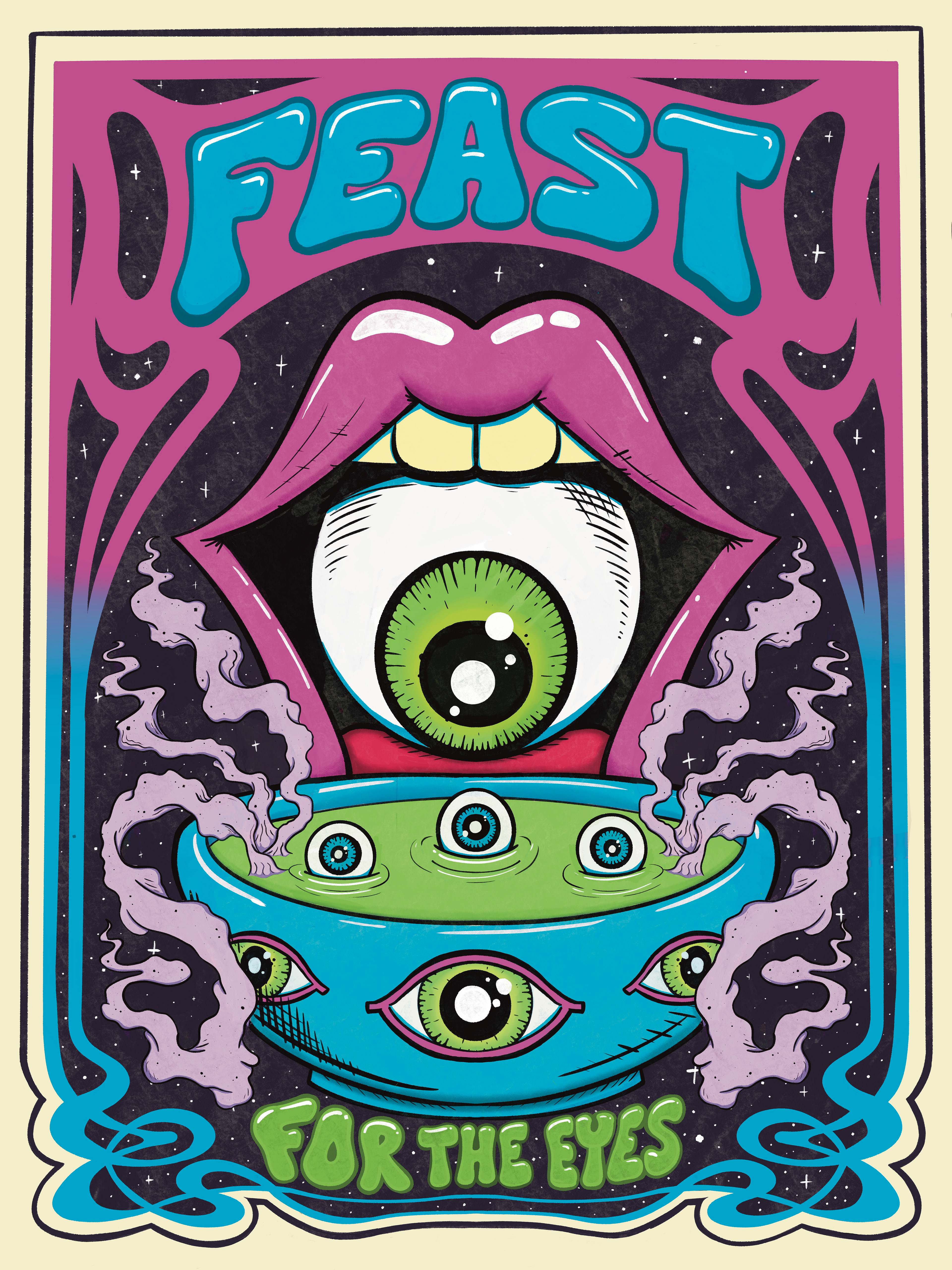
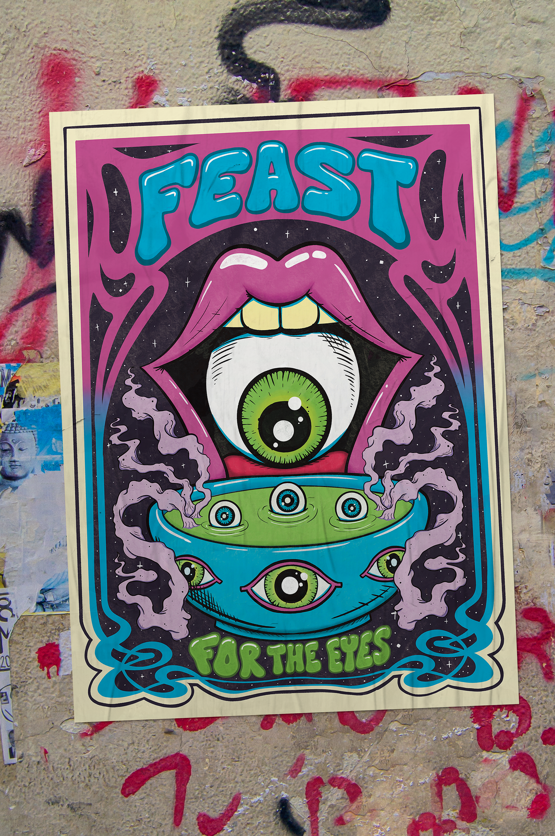
Feast for the eyes:

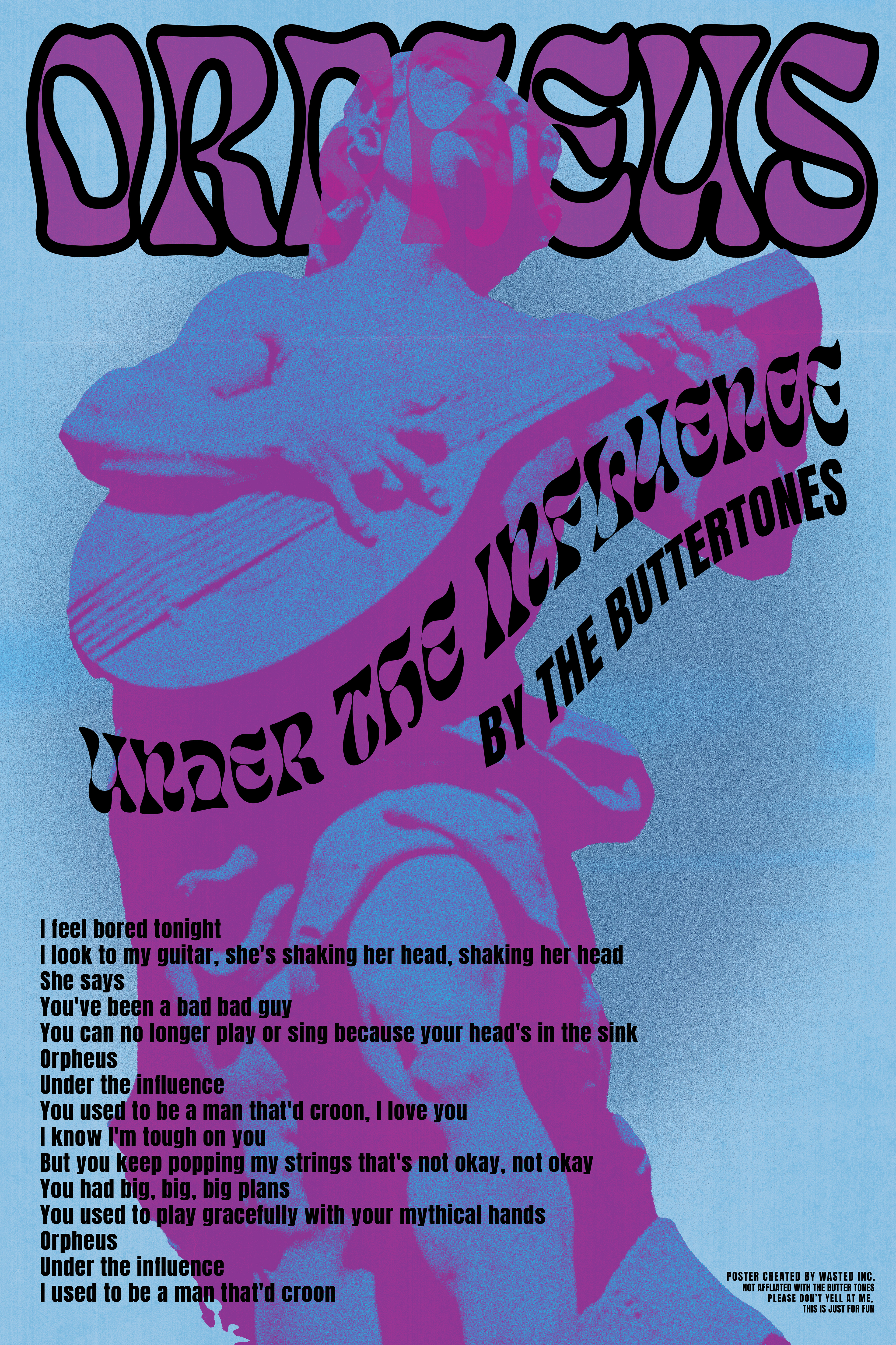
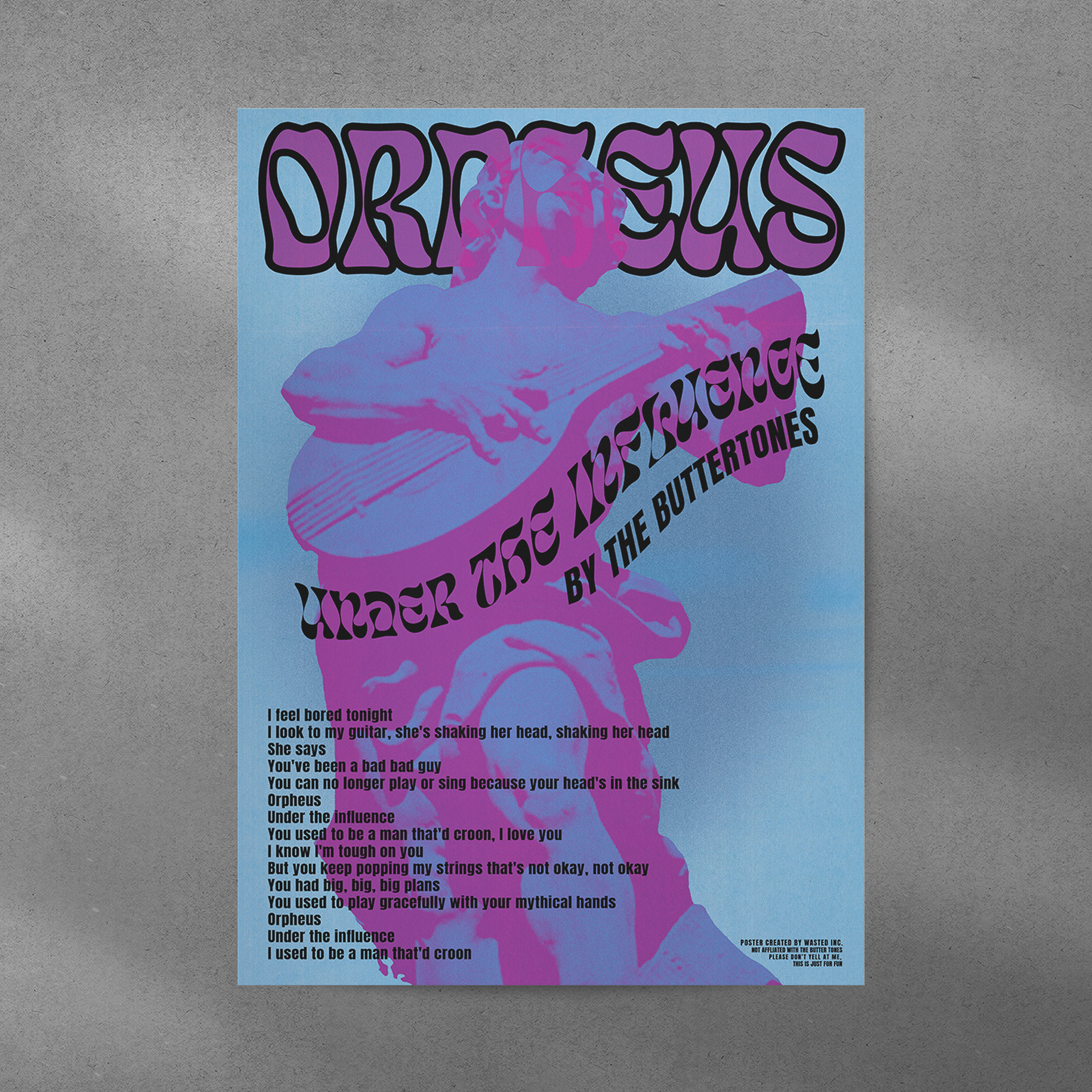
ORPHEUS UNDER THE INFLUENCE:
Based on Orpheus Under the Influence by The Buttertones, I experimented with threshold and noise effects to reinterpret the Orpheus statue in Poland. I also incorporated a subtle typographic layer using lyrics from the song to reinforce the concept.

WHERE BOYS GO TO GET STUPIDER:
This poster is based on the classic schoolyard rhyme, “Girls go to college to get more knowledge, boys go to Jupiter to get more stupider.” It uses a brutalist-inspired style with layered vector graphics and related visual techniques. The parody is carried primarily through the body copy, with subtle details in the smaller text reinforcing the concept.


TERRAS GAUDA:
This poster was created for a Terras Gauda competition. Unlike my typically more graphic-heavy work, this piece focuses on illustration in a surrealist style, depicting a melting bottle and wine glass as the wine spills out. The entire image was digitally painted in Procreate.